Innobot Health
Design system · Brand · Full funnel demand
Innobot Health sells revenue cycle automation into US hospitals and physician groups. I own how the company acquires customers, and the brand surface all of it travels on.
Read the business first
This is a long, high trust sale into hospital finance and physician group leadership. Nobody signs from an ad, and no single channel closes anything on its own. So the job was never to buy traffic. It was to build a path a sceptical committee could walk down over months without losing the thread, and to know at every step which part of that path was working.
Signal based outbound
Outreach at scale, aimed only at the accounts and the titles worth having. Segmented by what the buyer actually owns rather than by whatever the list happened to come sorted by, so the first line of every sequence is about their problem instead of my product.
Performance media
Paid programmes pointed at conversion surfaces built for them, never at a homepage. Each campaign has a landing experience that continues the sentence the ad started, and the measurement behind it exists to tell me which part of the funnel is lying to me.
An organic programme that compounds
The search foundation, the structured data and a content programme built so the work done this quarter is still earning next year. Service pages for every automated workflow the product covers, each one written for a specific buyer with a specific problem, not for a keyword.
The conversion architecture
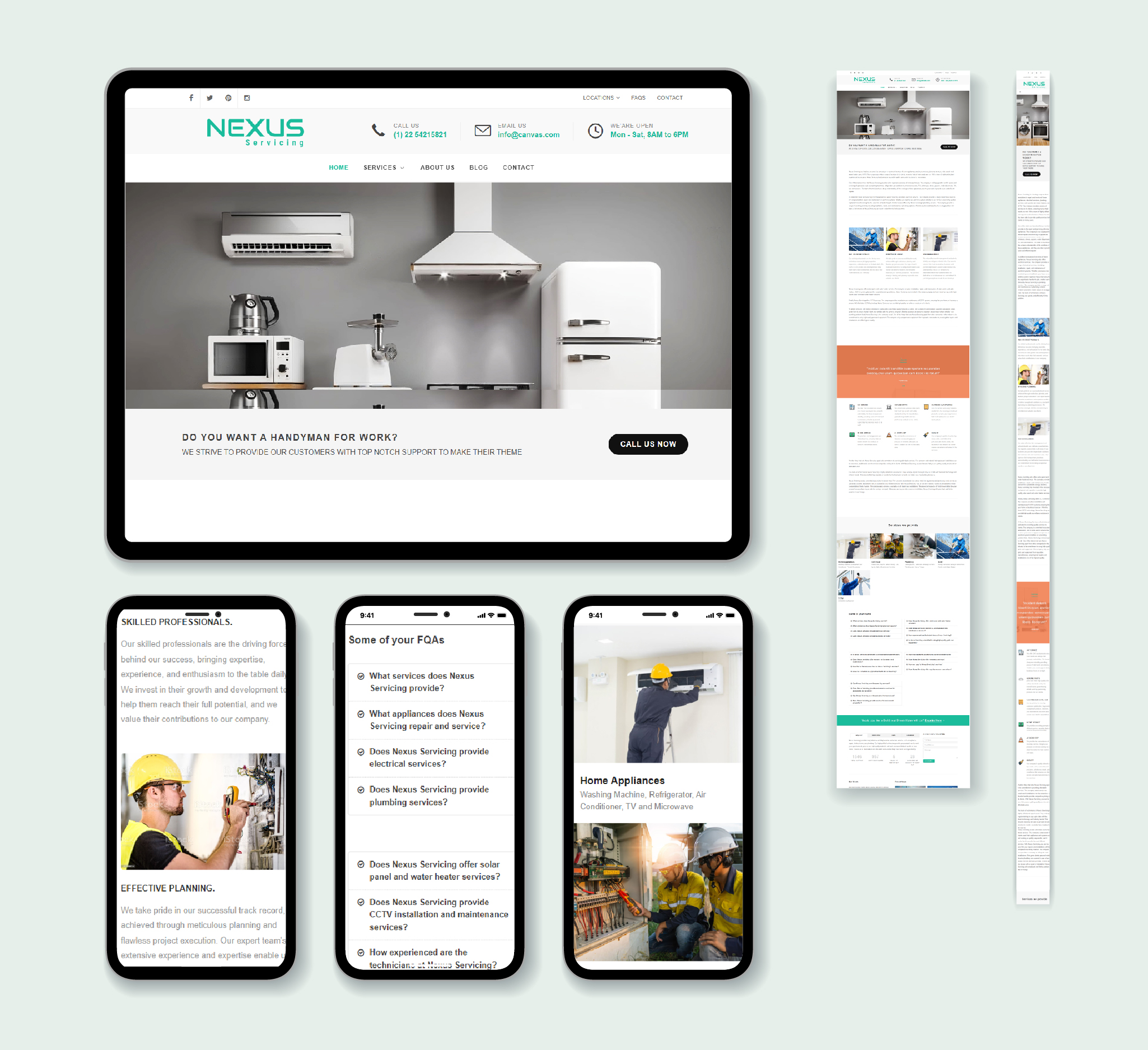
Eight automated service pages, three pages written for hospitals, provider groups and billing companies respectively, the platform page, and the trust and security material a healthcare buyer asks for before procurement will talk to you. Every one of them is a place a campaign can legitimately land.
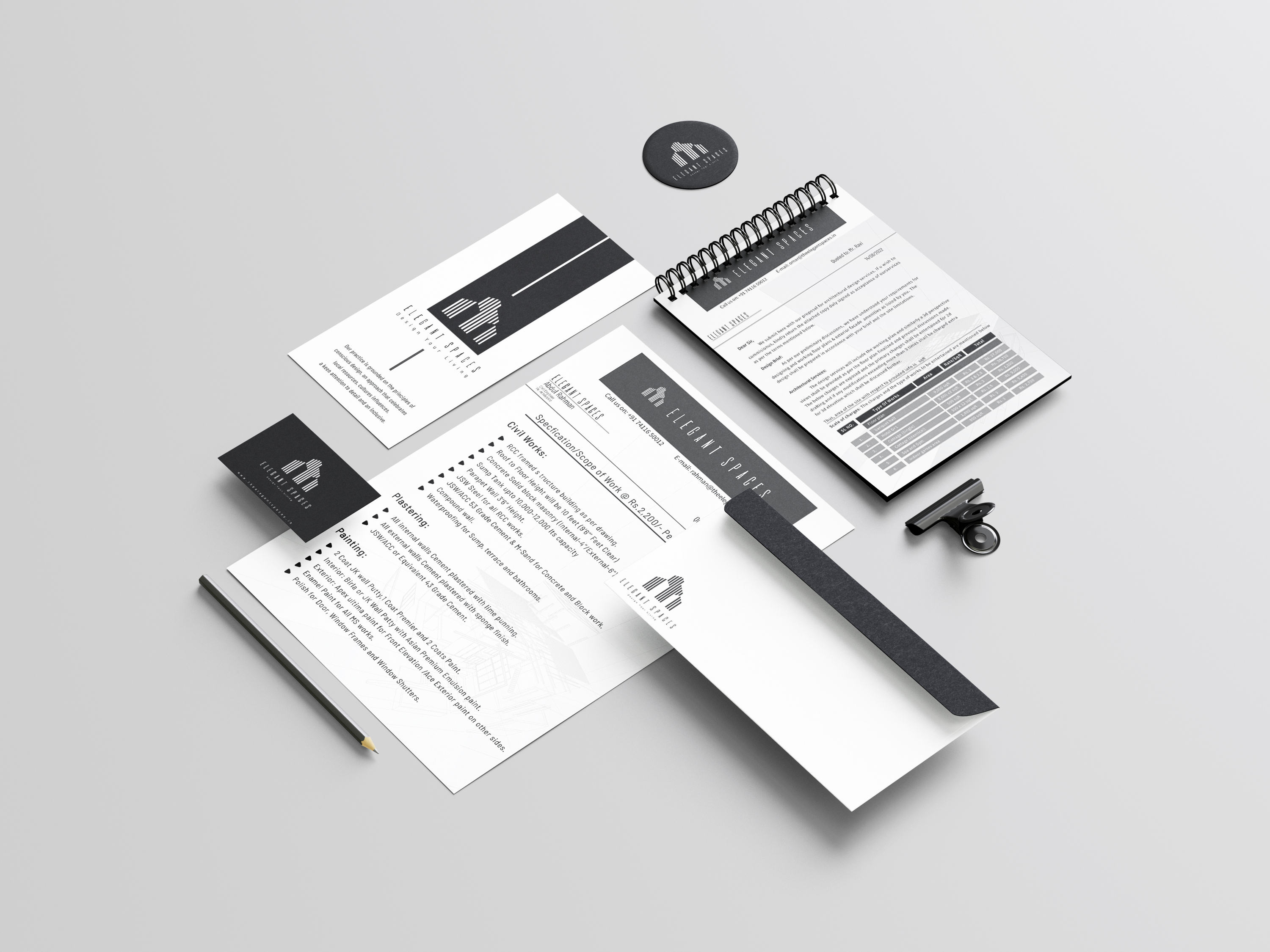
The brand surface
The site, the landing experiences, the creative, the social and the video. Building the demand and building the thing it points at in the same pair of hands means the two never drift, and a test ships the same week I think of it.
What follows is the whole of it. First the stack I inherited, chose, replaced and still operate, then the design system the brand surface runs on, because I built that before I built the site.
I inherited a WordPress site. Nothing else.
No analytics, no tag management, no CRM worth the name, no outbound, no paid programmes, no measurement of any kind. There was a website, and there was a sales team, and between those two things there was nothing at all.
Everything below I chose, wired together and still operate. Not a plan I handed to an agency. The actual stack, running in production, for a US revenue cycle company selling into hospital finance.
A WordPress site and a sales team
The site was the whole marketing function. Nobody could say where a lead came from, because nothing was instrumented to answer the question. There was no way to be wrong on purpose, which sounds comfortable and is actually the problem.
A full funnel with one owner
A site I wrote myself, instrumented for pipeline from the first commit. Demand capture, conversion architecture, outbound at scale, a CRM the process fits, measurement that survives scrutiny, executive reporting nobody has to request, and a content pipeline producing the proof that closes. One person owns the whole path, and a team I hired runs inside it.
So I rebuilt the site. All of it.
A theme cannot be instrumented properly. You can bolt analytics onto one, and most companies do, but what you end up measuring is whatever the theme happens to expose rather than what the business needs to know. That gap is where attribution quietly dies.
So I wrote the whole site myself. Custom from the ground up, which means the tracking is part of the build instead of a plugin sitting on top of it guessing at what matters. Producing qualified pipeline is the only reason this site exists, so it is what the instrumentation is designed around rather than an afterthought bolted on at the end.
Every conversion path is its own event
Demo requests, contact forms, whitepaper downloads and booking steps each fire deliberately, because I wrote the handler rather than hoping a plugin caught it.
Attribution survives the handoff
The campaign, keyword or sequence that produced a lead travels into the CRM attached to that lead, so the source is still knowable at the point somebody closes it.
Named for the questions, not the tool
Events carry the names the business actually uses when it asks what happened. Reporting built on a plugin's guess at naming is reporting nobody trusts twice.
Behaviour, not just outcomes
Heatmaps and session replay on the pages that carry pipeline, so a drop-off is something I can watch rather than something I have to theorise about.
Nothing loads that nobody needs
A custom build instead of a theme and a stack of plugins. The pages a paid click lands on are the fastest pages on the site, which is not a coincidence.
A system underneath it
The site runs on a design system I wrote before I wrote the site, which is the next section on this page and the reason the whole thing stays coherent.
Measurement
Nothing was being measured, so nothing could be argued about. This went in first, because every decision after it depends on being able to tell what actually happened.
Demand
Performance media and an organic programme that compounds, both pointed at surfaces built to receive them rather than at a homepage.
Outbound
Signal based sequences across email and professional networks, aimed only at the accounts and the titles worth having.
Pipeline
Where a reply stops being a reply and becomes an opportunity somebody owns, with the context already attached. It also carries the executive dashboards, so leadership reads the funnel without asking for it.
Proof
The content that closes rather than the content that decorates. A prospect sees their own workflow automated, in a video made for them.
Two of these are replacements.
Picking a tool is easy and everybody does it. Deciding a year in that it is the wrong one, and moving a live pipeline onto something better without losing a week of production, is the part that is actually the job. Both of these were my call.
The CRM was not the constraint on paper and was very much the constraint in practice. Moving a live pipeline between systems is unglamorous, risky, and the right call when the tool is shaping the process instead of serving it.
Outbound on professional networks ran on one platform until the use cases outgrew it. I moved the motion across rather than defending the original choice, because the sequence matters and the software running it does not.
The leadership team should not have to ask me.
The last mile of measurement is not a dashboard for the person who built it. It is a view for the people who do not have time to request one. So the CRM carries its own reporting: board level dashboards I built for the executive team, showing where pipeline came from, what stage it is in and what actually moved this week.
Nobody waits on me to assemble a deck, and nobody takes a number on trust. A growth function that only the growth person can read is a growth function nobody ends up believing.
Where it came from
Source, campaign and sequence, visible on the board rather than assembled by hand when somebody asks.
What moved this week
Which opportunities advanced, which went quiet, and which need a person before they go cold.
What is working
How each demand programme is contributing, so spend decisions are made against the board and not against a memory.
Then it stopped being a one person problem.
I edited the video myself before there was anybody to edit it. That works right up until the volume makes it the most expensive hour in the week, so I hired editors, built the pipeline they work inside, and now I direct it instead of doing it.
The pipeline itself is the interesting part. A cloned voice and a pixel accurate presenter let us put our CEO in a video made for one prospect, with generated b-roll behind her, in the time it used to take to schedule a shoot. That is what goes out after a demo, and it is why the proof arrives while the conversation is still warm.
Demand capture
Search, performance media and outbound all running into one path rather than three.
Conversion surface
The site, plus a landing experience per campaign that finishes the sentence the ad started.
Reply
Sequences answered by a person, intent read, the thread kept warm while the cycle runs long.
Qualification
Separating a polite reply from a real opportunity before anyone spends a call on it.
Demo
Handed to the sales team with the account, the problem and the history already attached.
Proof
A video built for that prospect, showing the agents we would run on their own workflow.
One person, whole funnel, first touch to booked meeting.
I built the system before I built the site.
Everything inside the frame below is Innobot’s own brand, rebuilt here from its source of truth and running live on this page rather than screenshotted. It sits in its own container deliberately: this is their design language on display, not mine.
One system, every surface.
Innobot sells revenue cycle automation into hospital finance. The committee is sceptical by default, the cycle is long, and the first thing anyone judges is whether the company looks like it can be trusted with their claims.
So the surface could not look like a guess. I wrote the system first and built the site on top of it, which is the only reason one person can keep this many pages coherent and still ship a new one in an afternoon.
Rules, with reasons attached.
A design system is not a colour palette. It is the set of arguments nobody has to have twice. Every rule below is written with the reason next to it, because a rule without a reason gets broken the first time it is inconvenient.
- 01
Ground is #050708, never pure black. Pure black reads as a hole punched in the panel on an OLED screen, and the teal mist has nothing to sit against. Sections may drop to true black, but only as a recessed band.
- 02
Teal means value or success. Nothing else is ever teal. And labels are never teal when the value is, so the eye lands on the number rather than the word beside it.
- 03
Amber means a human is needed or something is waiting.
#e85d69means blocking, and only blocking.#e63946is the hero pain accent and is never a UI state. Three colours, three meanings, no overlap. - 04
Every card is the same glass.
rgba(13,17,21,0.42), blur 16px, saturate 1.6, a 1px#1a2429border and an inset top line at 7% white. Radius 22 for stage cards, 16 for general, 24 for bento. - 05
Three type voices, one job each. Fraunces light for display with italic on the accent phrase only, Syne for interface and headings, IBM Plex Mono for every label, identifier and number, uppercase and tabular so figures line up in a column.
- 06
One card, one view. The density caps are hard: eight rows, five chips, four lines, two findings. Past that the card is lying about how simple the product is.
- 07
Recognise, then transform. Consecutive stages show the same card changing state, never a fresh card. The viewer should never have to re-find their place.
- 08
Glow is layered, never a single blur. Halo at 8 to 12 times the core at 6 to 10% opacity, a mid pass at 3 to 4 times, then the core at full with a near-white centre.
- 09
Entrances run 0.6 to 0.7 seconds, ease-out, staggered 0.1 to 0.15. Never ease-in on an entrance. Two or three moving things per composition, never more.
- 10
No invented statistics. Any number on screen that is not sourced gets labelled illustrative, on the site and in the deck alike. It is the rule that costs the most and earns the most.
Colour that means something.
Six values carry the whole site. Three hold structure, three hold state, and state colour is never decorative. Once colour carries meaning, an operations dashboard reads at a glance and nobody has to learn a legend to use it.
Three voices, one page.
Fraunces carries the display line, kept light, with italic reserved for the one word that matters. Syne runs the interface. IBM Plex Mono handles labels, identifiers and numbers. A reader never has to work out which register they are in.
Two buttons. That is the whole set.
A primary and a ghost, both fully round, and a mono label pill in three states. Any more than this and a page starts offering the reader choices instead of a next step. The primary carries a sliding arrow so the action reads as movement.
Glass, done properly.
Cards are translucent over a teal mist that advances as you scroll. It looks like a styling choice and it is closer to a browser-internals problem: blur refuses to composite inside a fixed ancestor, a finished entrance animation quietly kills the blur behind the nav, and the build tool drops half the webkit pair depending on declaration order.
Each of those cost a day to find. The cards below use the real mechanism, not a picture of it.
Illustrative figures
One card, many shapes.
The service pages are built from a twelve column bento. One card definition spans different widths and frames a different product view inside the same inner panel, so a page can be composed rather than designed. Hover any card: the border warms, it lifts three pixels, a teal bloom comes in from the top and a hairline sweeps across the bottom.
Eligibility, checked before the visit
The wide card carries a full product view. Rows use the same state colours as everything else.
Clean claim rate
The narrow card carries one number and nothing else.
Illustrative
Denials, worked by reason code
Half width, list view. Density is capped at eight rows on purpose.
Posting, reconciled nightly
Same card, same inner panel, a different view. Nothing bespoke.
Illustrative data throughout
One claim, followed all the way through.
The hardest thing to explain about this product is that it is not one feature, it is a path. So the page does not describe the path, it runs it: a single claim enters at the top and you watch the same record move through five stages as you scroll. Not five panels swapping over, one continuous shot.
That is the system’s own rule about recognising before transforming, applied at page scale. Because the card never gets replaced, nobody has to re-find their place, and the argument lands without a word of explanation.
- Claim ID
- CLM-2026-48212
- Format
- UB-04 · Institutional
- Payer
- Anthem BCBS · PPO
- Billed
- $4,862.00
- Source
- Report agent
- Received
- 09:42:18
Intake
A claim arrives one of seven ways, and the channel is recorded with it.
- API connection
- Scheduled export
- Report agent · charges
- Report agent · denials
- Report agent · A/R
Routing
Every event has exactly one next action and exactly one queue.
- Eligibility · 14
- Authorization · 09
- Claim status · 22
- Adjustments · 06
- Appeals · 04
Execution
Five levels of support, tried in order, each one cheaper than the next.
- APIs
- AI agents
- Chatbots
- Voice calls
- Human support
Write-back
Every result returns to the system of record. Nothing lives only here.
- Eligibility results
- Authorization status
- Payer response
- Notes
- Payments posted
Analytics
What actually happened, with the caveats attached to it.
- 1,000 tasks
- 96% success rate
- Cost to collect 2.2%
- Denial rate 4%
Illustrative record · transcribed from the live claim flow
Five levels of support, and a colour each.
Automation is sold as a binary and it never is one. The platform tries five methods in order, cheapest and most reliable first, and falls down the ladder only when a level fails. Showing the ladder honestly is a better argument than claiming full automation, because the buyer already knows full automation is not real.
Each method carries its own ink, and those four hexes are sourced rather than chosen: they are the same colours the platform publishes its processing mix in. The last rung is amber, because amber means a human is needed, and that is exactly what it means here too.
Same geometry, opposite story.
The problem chart and the outcome chart are the same six curves. Identical paths, identical grid, identical endpoints. Only the colour ramp and the legend change. A reader recognises the second chart instantly as the first one inverted, which is the entire argument the page is making, delivered before they read a word.
Without automation
DriftingWith IRIS
ImprovingIllustrative shapes · not performance claims
Every panel ships with its own caveat.
The platform and service pages are mostly dashboards, and the discipline that makes them credible is not the styling. It is that each one carries a note limiting what it claims. A submission is not an approval. A passed check is not a payment. Coverage confirmed for a visit does not guarantee it gets paid.
Writing the caveat into the component, rather than leaving it to whoever fills the panel in, is the difference between a dashboard a hospital CFO trusts and one they quietly discount. It costs conversions on the page and wins them in the room.
A/R Aging
$28M outstanding · IllustrativeNote. Aging reflects billed balances, not expected collections. A bucket shrinking is not the same as cash arriving.
Processing mix
1,000 work items · IllustrativeNote. Ten percent stays manual by design. A mix that claimed zero would be the least believable number on the page.
Claim outcomes
100 claims in sample · IllustrativeNote. Paid and partially paid are counted separately on purpose. Merging them is the most common way this chart gets used to mislead.
Operating metrics
IllustrativeNote. Every figure on this page is illustrative. None of it is a performance claim, and the system labels it that way so nobody has to ask.
Showing the product without a screenshot.
Screenshots age badly and leak real data. Every product view on the site is built from the same design tokens as the page around it, so the product always looks current and never shows a patient. On the left, the eight revenue cycle workflows converging on one engine. On the right, a multi-facility board built from the same rows, bars and mono labels as everything else.
Illustrative data
The system had to hold.
Eight automated service pages, three audience pages, the platform, and the blog, case studies, careers, whitepapers and trust pages behind them. Built on Next.js 16 and React 19. Page families share one component set and one scoped stylesheet, so a change to a card lands everywhere at once instead of in eleven places by hand.
The site is the argument. It has to look like the product works.
Visit innobothealth.com →